Let’s be real: most startups and small teams can’t justify $1,200/year per user just to build a dashboard.
That’s why at PolarPath, we often help clients squeeze every ounce of power from free tools before scaling up. And in 2025, there’s no shortage of free data visualization tools that are actually worth using.
Whether you’re tracking KPIs, building reports for clients, or just getting started in analytics, these tools will help you move fast without blowing your budget.
What Makes a “Great” Free Data Viz Tool?
It’s not just about being free. The tool must:
- Handle real datasets (not toy examples)
- Be easy to use or well documented
- Offer real dashboarding or visualization capabilities
- Work with your existing stack (Google Sheets, CSV, SQL, etc.)
Let’s break down the best ones.
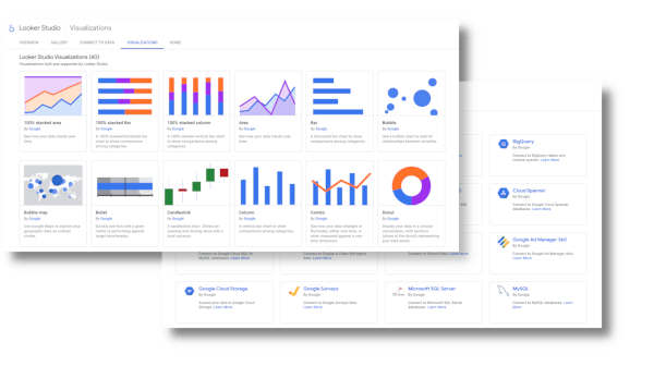
1. Looker Studio (formerly Google Data Studio)
Best For: Marketers, startups, agencies, nonprofits
Overview:
A powerful, fully free dashboarding tool by Google that integrates seamlessly with Sheets, Ads, BigQuery, and dozens of connectors.
Top Use Cases:
- Marketing performance dashboards
- Client reporting for SEO/PPC
- Business health snapshots from Sheets or GA4
Pros:
- 100% free, no tiered features
- Easy for non-technical users
- Works well with Google Workspace
- Real-time updates, shareable reports
Cons:
- Sluggish with large datasets
- Limited advanced interactivity
- Complex joins and data modeling = painful
Used By:
Freelancers, agencies, and companies like Wayfair and HubSpot for internal marketing reporting.
2. Datawrapper
Best For: Media companies, journalists, simple charting needs
Overview:
Designed for non-technical users, Datawrapper is a clean, easy tool for making charts, maps, and tables you can embed anywhere.
Top Use Cases:
- Data journalism
- Embedded graphics in blogs or reports
- Quick charts for social media or newsletters
Pros:
- No install or account needed
- Super fast to use
- Accessible chart types like bar, pie, maps, etc.
- Free for unlimited basic use
Cons:
- Not ideal for dashboards
- No real-time updates
- Security concerns with sensitive data
Used By:
The New York Times, Statista, UNICEF, and media outlets worldwide.
3. Chart.js
Best For: Developers and web projects
Overview:
A lightweight, open-source JavaScript library that lets you embed beautiful charts in any web project.
Top Use Cases:
- Interactive website charts
- Embedded visuals in internal portals
- Custom dashboards for apps
Pros:
- Fully open-source and community-supported
- Responsive across devices
- Integrates with frameworks like React, Vue, Angular
Cons:
- Dev skills required
- Not suitable for rapid prototyping by non-technical users
Used By:
Countless devs and companies powering internal tools and client dashboards on the web.
4. RAWGraphs 2.0
Best For: Designers and researchers who need uncommon visual styles
Overview:
An open-source tool built for creating unusual, creative visualizations using TSV or CSV data.
Top Use Cases:
- Visual storytelling for academic or policy reports
- Custom infographics
- Exploratory visual research
Pros:
- Great for non-standard charts (e.g., chord diagrams, treemaps)
- No login or install
- Data never leaves your browser (privacy-safe)
Cons:
- No live dashboards
- Not designed for real-time analytics or business users
Used By:
Designers at universities, NGOs, and data storytelling projects.
5. Observable
Best For: Data analysts and JS developers who want to create interactive notebooks
Overview:
A powerful platform that merges code and data visualization, similar to Jupyter but focused on JS and interactivity.
Top Use Cases:
- Interactive data notebooks
- Prototyping advanced data visualizations
- Teaching and sharing data concepts
Pros:
- Highly interactive and visual
- Built-in D3.js and other libraries
- Reusable templates for visualizations
Cons:
- Requires coding (JavaScript)
- Not ideal for classic dashboards or managers
Used By:
Airbnb and Stripe engineers for internal data sharing.
6. ChartBlocks
Best For: Quick, no-code chart generation from spreadsheets
Overview:
A chart-building wizard that lets you upload a dataset and generate charts in minutes.
Top Use Cases:
- Basic visualizations for presentations
- Embedded visuals on websites or landing pages
- Sharing clean charts without technical work
Pros:
- Easy to use, no code
- Export to PNG/SVG
- Social sharing built-in
Cons:
- Limited chart customization
- Free version restricts data sources and export formats
Used By:
Nonprofits, educators, and marketing freelancers
7. Chartist.js
Best For: Lightweight, responsive charts on the web
Overview:
Another developer-focused JS library, built for responsive visuals with minimal setup.
Top Use Cases:
- Mobile-optimized charts
- Dashboard widgets
- Apps with flexible, fast charts
Pros:
- Clean animations
- Works well across screen sizes
- Open-source and well-documented
Cons:
- Not built for dashboards or analytics
- Limited to basic chart types
Used By:
Open-source projects, developers in startups, embedded UI components
Final Take: You Don’t Need to Pay to Play
Most small businesses, agencies, and solo operators can get 80% of what they need from the free tools above, especially Looker Studio, Datawrapper, and RAWGraphs.
The trick is knowing which tool fits your use case:
| Use Case | Tool |
|---|---|
| Marketing / Sales Dashboards | Looker Studio |
| Journalistic / Report Visuals | Datawrapper |
| Custom Visual Experiments | RAWGraphs / Observable |
| Dev-Based Apps or Websites | Chart.js / Chartist |
| Quick Visuals from Spreadsheets | ChartBlocks |
Want These Connected to Your Systems?
At PolarPath, we are experts on data to live data with automation layers, so you can build dashboards for you to never touch them again.
Need help getting started or leveling up?
Book your free strategy call at polarpath.ca
Posted by